Inside The Haus: Lucas Buick, CEO and co-founder, Hipstamatic
Lucas, tell us about your professional background before Hipstamatic.
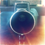
I went to art school, where I met Ryan the other co-founder; we ran a design studio from September 2006. In 2008, a lot of our big clients stopped paying their bills, and that’s when we decided that we should get out of the service business. We looked at starting a wine label, re-packaging existing wines. The other option was to do mobile software. To do wine you have to one: know somebody in wine, and we didn’t know anybody. Two: you need money, and we didn’t have any! So, in August 2009, Ryan and I sat down and started whiteboarding mobile apps. I had a couple of photo apps on my phone, there were some pretty cool ones back then. We also had this old Polaroid SX70: every time somebody came by our studio we’d shoot their portrait and put it on the wall. Thinking about that, what we loved about toy cameras in general was this romantic idea that you didn’t have to think […] you just hit the button and it does all the stuff for you, what you get is what you get, and it felt very ephemeral. It was temporary, it didn’t matter, but at the same time it could push into high art. We really wanted to recreate that feeling.
How did you come up with the first set of filters for Hipstamatic?
The original set of Hipstamatic filters was basically my library from a ten-year career doing retouching as the art director of a fashion magazine. Ryan coded it in such a way that you hit a yellow button, and he was able to do work that used to take me hours in a few seconds.
How did it go when you first launched the app?
We put out the app in December 2009; the first day I think we sold 10 copies to our friends, but then the next day we sold 100, and the following day we sold 500, the day after that we sold 1000: all of a sudden we had all these people using it. We were the number 1 app in Japan within the first 36 hours, which was crazy, so I called all my designer friends and told them I was big in Japan!
Over the New Year of 2010, Apple featured Hipstamatic, and all of a sudden we had even more people coming in. I think we had 10-20,000 users. We wanted to build a community of people, because we kept seeing such great photos. We created a photo contest, using the Flickr service so you had to upload your photo to Flickr, and then to get votes and communicate you had to go through Twitter. The community started growing again, even more than when Apple featured us, we had this whole network of people. We hired Aravind, our creative director, right away, who we had talked into designing the app for us originally.
We turned down a big project to work on Hipstamatic, and by the time the app came out, I think we had $1.83 in our bank account. All of a sudden it was no longer a concern, I think we spent about $300 total to build Hipstamatic, we pulled favours from every friend that we had in the creative industry. We paid a lot of people with beer early on!
You started Hipstamatic with just two people?
Yeah I designed all the effects, and Ryan learned how to code for Apple. We rewrote the code, and because we were number one in Japan, we released the Shibuya HipstaPak, as homage to our new audience. Apple approved the update right before Christmas, but then they shut down the app store and didn’t approve the Shibuya HipstaPak, so it was showing up in-app, but you just couldn’t buy it, so we had a lot of angry people that holiday.
Hipstamatic is like a rock star and we’re the manager. We just let it grow, and it’s interesting to see what this whole community does with the effects. I know technically how everything works, but I still look at people’s photos and don’t know how they managed to capture what they did. The community takes Hipstamatic and does amazing things with it, which inspires us to do more stuff.
Personally I use Hipstamatic everyday, but I don’t use the original effects anymore. I’ve out grown the John S and some of the really early ones, now it’s all about the new black and white film, which is a favourite of mine. I love black and white. That’s probably why there’s so much black and white film on Hipstamatic.
The original website is one of the main reasons I bought Hipstamatic, the pages showing each pak were beautifully designed.
We built the first Hipstamatic website in a couple of days. We put the websites together to show people what we did, the amount of work that we put into designing packaging and creating lenses for all this stuff. That’s just the level of detail we have, being design-first, not tech-first. It’s always been about the look and feel. It was more about how it makes you feel, rather than the results. Early on, one of my favourite things about Hipstamatic was the flash sound effect. That reminded me what it was like to shoot with a camera. However, Somebody who is 21 right now has no idea what that sound means.
It was about 4 days in, and I realized for the first time in my professional career that I was having fun, and we were actually making money for the first time ever. Originally we built it for ourselves, we thought okay, there’s probably a hundred people nerdy enough like us that’ll like this, but then to watch the community’s response, the early reviews were like, "I love the app, I love the effects, I hate the name", because it had the word 'hipster' in it, which meant for us that we’d hit the audience that we were talking about. That was the moment: it took about 4 days.
What about a timer for Hipstamatic Classic?
A timer is something we’ve looked at, and we haven’t ruled it out. It’s just about figuring out how to make that fit with the analogue experience of Hipstamatic Classic.
There’s a lot of things on Hipstamatic Classic that people have asked for, the other thing is a front facing camera, but I don’t think that will ever happen.
Everybody knows that Hipstamatic is going to put out a Pak, and we have a lot of people who will buy it, and we’re grateful for that. On occasion we’ve tried to go back and modify a few things over the years, and you then see people starting to use that gear more, because the photos look better. The original Jimmy lens used to blur your photo on purpose, then when the iPhone 4 came out, all of a sudden the Jimmy lens didn’t blur and people started shooting with the Jimmy lens more, so we modified it to reflect the change in the hardware.
What about a new flash for Hipstamatic Classic?
The last time we really dedicated time to building a flash was for the Jolly Rainbo 2X. The problem with using the hardware flash is that it washes everything out. On the Jolly Rainbo 2X, we designed it to work with the real flash too; when that goes off, the software flash basically darkens the image. There’s other stuff that’s interesting around flash and lighting that we haven’t really explored yet, maybe we should.
Talking of exploration, Oggl is a great adventure into uncharted territory for you…
Oggl’s release was new territory for us — to change the rules on everybody. I think it’ll be an interesting transition for some Hipstamatic users, bearing in mind that it’s the same, but different. I think in the end, it’s just a different product that can do more.
Working with someone like Nokia, one of the things I’m most excited about, we’re actually working with a 41 megapixel camera, and thinking about how to build filters and new looks with that kind of hardware. It’s a different challenge. With the original Hipstamatic stuff, we were adding blurs and texture layers to hide the low quality of the photos themselves.
But you’re going to keep Hipstamatic Classic?
Absolutely! Oggl is a different experience and we really love it, but we still have a soft spot in our hearts for Hipstamatic Classic, and so does our community, so it’s not going anywhere!
Some people in the Hipstamatic community are so totally in love with Hipstamatic Classic that they feel like Oggl is cheating.
We agree that it’s "cheating", there’s something really magical about people who shoot with Classic. You know they only have that one chance and they didn’t cheat. What took us so long to integrate Hipstamatic with Oggl, was making sure we imported all the data from Hipstamatic and give credit to those photos, so that they’re marked in Oggl as being shot with Hipstamatic as opposed to Oggl.
What led to the development of Oggl?
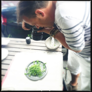
We wanted to reinvent something that made more sense for the modern mobile point and shoot experience. In 2011, when we worked with David Loftus, we really started changing how we built Hipsta Paks, starting with the Foodie SnapPak. David’s professional work is absolutely beautiful, gorgeous, but then he’d always shoot the Shibuya HipstaPak with some weird flash and the food would come out blue and green. I was like "Okay fine, if David is going to use this and continue to shoot food, and everybody is shooting food and their lattes, let’s create something to at least make those photos beautiful."
That was really a change for us. It was no longer about all the nostalgic films. It was no longer about looking back to the 60s and 70s for inspiration it was looking forward. That kicked off a whole change in looking at how people were shooting, and saying, "Okay, if you’re going to shoot food use the preset we’ve made for food", but at the same time, the Hipstamatic community says, "I’m going to take this lens and this other film and I’m going to make my own look", it’s very personalized.
It’s a different user group, it’s a little younger on Oggl than it is on Hipstamatic Classic, but we wanted to keep the heritage of what Hipstamatic is about, which is this analogue reference, but with a new face on it. We still don’t care where the photos end up; we look at our job as being to help people take great photos. We build all of these things so it’s easy for a new generation to come in and get into photography.
Why didn’t you combine the best features of Hipstamatic and Oggl into one app?
So many people have completely fallen in love with what Hipstamatic is, how could we ever touch that? I love our community, but there’d be a line outside of angry photographers!
Hipstamatic is not going to change. It was always meant to feel like a plastic camera. Even to the point where we might have gotten a little obsessive about it. We had a long discussion about the size of the viewfinder. When we designed Hipstamatic, we wanted to change the pose of how people take photographs, and for this change to go all the way into the physical world.
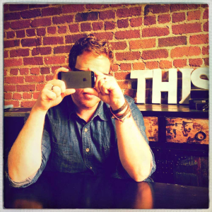
If you remember, when I was a kid, you’d put your face up to the viewfinder and this was the photographer’s pose [the face right up to the camera]. I could always tell when someone was taking a picture with Hipstamatic because we wanted them to be here [in the photographers pose]; a lot of thought went into that kind of thing.
It really was about surprising people with the results, about them surprising themselves with what they were going to see. That became really important to us in Hipstamatic Classic, and those kinds of romantic and nostalgic ideas will never leave Hipstamatic. Oggl gives us a platform to think about things a little differently, but the love of doing this [taking photos up close to the iPhone in the photographer’s pose] is what Hipstamatic is about.
The latest Oggl update has caused a lot of commotion. Have you been surprised by the kinds of responses there have been?
I'm not surprised at all. We have a very passionate community who've never been afraid to share their feelings with us. The features that we are adding to Oggl are very different in philosophy compared to Hipstamatic Classic's philosophy over the last 4 years. It's important to understand that while Oggl and Hipstamatic Classic share DNA, they are different products. For example, Oggl is a product that is much more "open" than Hipstamatic Classic, and so for us it comes with a new responsibility to protect our community against thieves and blatant copyright infringement. At the same time, it's even more important for us not to limit self-expression and creativity. This will be one of biggest challenges as we grow.
What direction will Oggl be developing in the future?
Our goal is to make Oggl a place where people can go to be inspired by photographs, a place for the most inspiring images by the most talented photographers. While Oggl has many "social" features, it isn't going to become a social network, it won't replace realtime communication via photography. Instead, Oggl is a collection of timeless images. Over the coming weeks, we will release a number of tools to help people curate their photo obsessions, as well as capture tools that inspire us all to take more photographs.
Could you tell us what your favourite lens, film, flash and combo are?
My current favourite set up, which I call "The Old Chap", is the new BlacKeys Extra Fine film with the Madelena lens. I almost exclusively shoot with black and white: all of my favourites are black and white.
My favourite lens? Loftus. My favourite film: all of the BlacKeys. And I use the Jolly Rainbo 2X.
Hipstamatic or Oggl?
Oggl
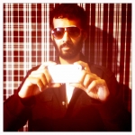
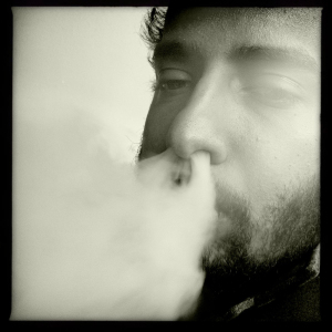
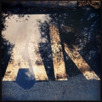
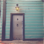
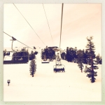
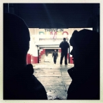
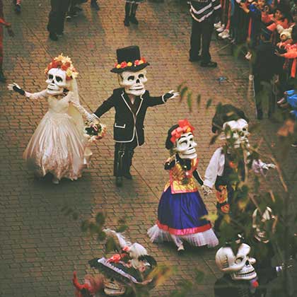
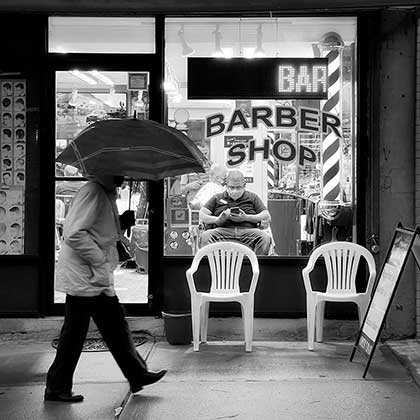
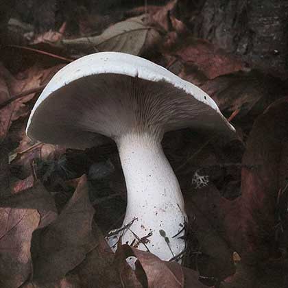
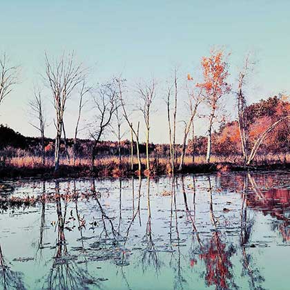
Photos: Lucas Buick - [button color="black" link="http://oggl.me/lucas/"]Oggl[/button]
Next meeting: Ryan Dorshorst
This post is also available in: French









2 Comments