Oggl, Simone Muresu’s review (Hipstamatic Sardinia)
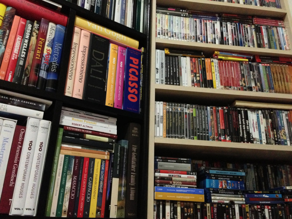
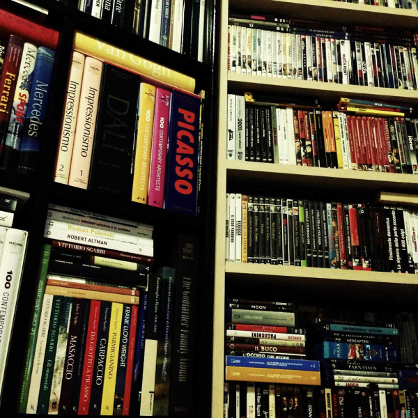
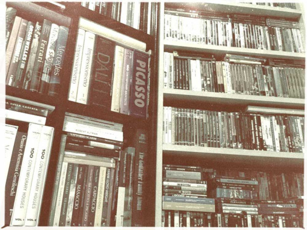
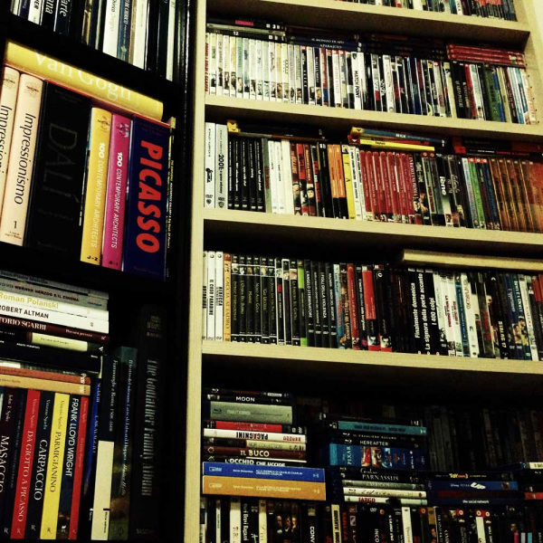
The first thing I noticed as soon as I started using Oggl is that there’s something strange in framing the picture. I placed my iPhone on a tripod using the adaptor and framed my subject, and then shot 5 pics without moving the iPhone, using the following settings:
1st photo: iPhone camera
2nd photo: Hipstamatic (GSQAD + Blanko Freedom 13, no flash)
3rd photo: Hipstamatic Disposable (El Mario)
4th photo: Incredibooth (Isoblak Cabine + Filthy Dirty Rotten)
5th photo: Oggl
1. iPhone camera:
2. Hipstamatic:
3. Hipstamatic Disposable:
4. Incredibooth:
5. Oggl:
The first four are all spot on (my subject is framed in the middle as I intended it to be). The shot made with Oggl is a different story: if we draw a vertical line to divide the Hipstamatic picture in two equal parts and then shoot again with Oggl keeping the iPhone still, the line moves to the left approximately 1/6 from the centre, as if I’d moved the iPhone to the right. This little peculiarity aside, let’s have a closer look at Oggl (which we can nickname Hipstagram).
Pros
1. You can edit your pics after shooting choosing from all lenses / films range, except GS-0 film (28 lenses, 29 films, 812 combinations).
2. Basically, from a single shot you can have (with a little patience) 812 shots with 812 different combos.
3. Built-in social network (one of Hipstamatic’s greatest limitations was the absence of a dedicated social sharing aspect, like Instagram).
4. You can share directly on facebook, Twitter, Instagram, Foursquare, Flickr.
5. No lapse between shooting and developing: depending on the combo (for ex. Tinto, Hornbecker and Americana in combination with Blanko Freedom or Dylan), Hipstamatic needs up to a minute to develop a shot on iPhone 4s, a bit less on iPhone 5.
6. No 9 pics consecutive shooting film limit.
7. Quality and resolution are identical to Hipstamatic.
8. All films and lenses random effects are kept (so for example using Dylan film you can open and close the app several times to get all “burnt” effects; again, all it takes is a little patience).
9. For amateurs there are different auto modes (like in standard cameras), Food, Landscape, Portrait and Nightlife; you can also add your favorite combos to these, like in the original app.
10. Just like in Incredibooth, you can use the front camera of the iPhone.
Cons
1. Compared to Hipstamatic, there is neither flash (which I always use in no-led mode, Jolly Rainbo 2X and Cherry Shine in particular) nor Multi Exposure (which set Hipstamatic apart compared to any other photo app).
2. Both volume buttons and remote control cannot be used to shoot - you can only use the yellow virtual button.
3. With the new editing feature (even though only in app and not using external ones), Hipstamatic’s trademark instant camera feel is lost. The design is less appealing and vintage compared to Hipstamatic, Incrediboth and Disposable. Also, you cannot change the case, another unique Hipstamatic feature in the photo app market.
4. Sharing buttons and image scrolling controls are not too intuitive and in my opinion are not very functional.
5. Display is on the left, holding the iPhone horizontally; I would definitely prefer to have it in the middle like in Hipstamatic and most photo apps.
6. Film and lens icons are small and difficult to click on: - it would be better to make them at least 20% bigger and to separate them (for example by placing the display in the middle, lenses at the top, films at the bottom or even recycling the Hipstamatic interface).
7. It would be advisable to connect the other Hipstamatic apps to this new “Hipsta social network”, so that pics can be shared into it from all of them (Hipstamatic, Incredibooth and the underrated Disposable).
© Simone Muresu
[button color="blue" link="http://www.facebook.com/simone.muresu"]facebook[/button] [button color="blue" link="http://www.facebook.com/groups/hipstamatic.sardinia/"]Hipstamatic Sardinia Group[/button]
This post is also available in: French





11 Comments