To be Square or not to be Square
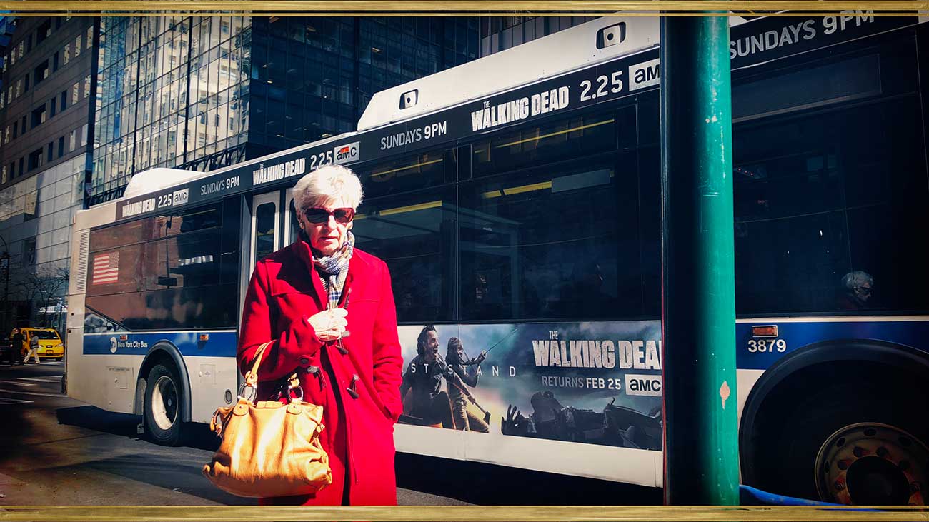
When Lori Hillsberg sent me her series "Characters of New York", I had a bit of a visual shock when I saw the format of the pictures. Using a 16:9 format, she added a fierce energy to the series. I honestly think these pictures would not have been as powerful had Lori used the standard 1:1 format.
(Photo: Lori Hillsberg)
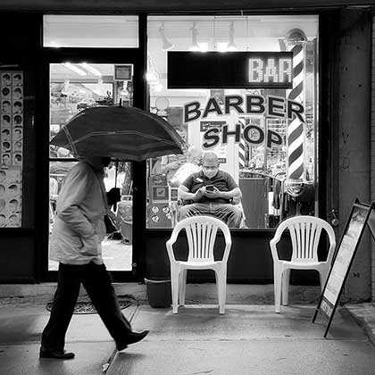
Ever since Hipstamatic came into my life, I’ve adored the square format for many reasons, among them something I’d qualify as nostalgical. When I was small my parents took a lot of pictures and in the 70’s the square format dominated. I still have a few of them lying around and, subconsciously, my brain has cherished the square format. In the following decades the 3:2 format took over, especially during the nineties with the emergence of the first digital cameras for the general public. As far as photography goes, I found this period to be quite disappointing: no effects, no filters, just "flat" rectangular photos, kept on hard drives.
All of that changed with the arrival of the iPhone and, more specifically, with applications such as Instagram and Hipstamatic, as they brought back the square format. Not to mention the effects and filters! It was, once again, possible to do away with the "rule of thirds" and let your imagination fly. You could play around with the lines leading the eye toward the subject, whichever way you decided to take your picture, the various plans and even the depth of field, etc. Hipstography - the site itself - was constructed around the model of square pictures, but when the 300-version was released in 2015, Hipstamatic changed the rules of engagement again.
Even though the square format remains the standard to this day, other ratios gave us a number of lovely opportunities to compose our pictures differently. Lori Hillsberg’s series is proof that habits sometimes need to be adjusted along the way and that it’s good to leave your comfort zone every now and then.
(Photo: Lori Hillsberg)
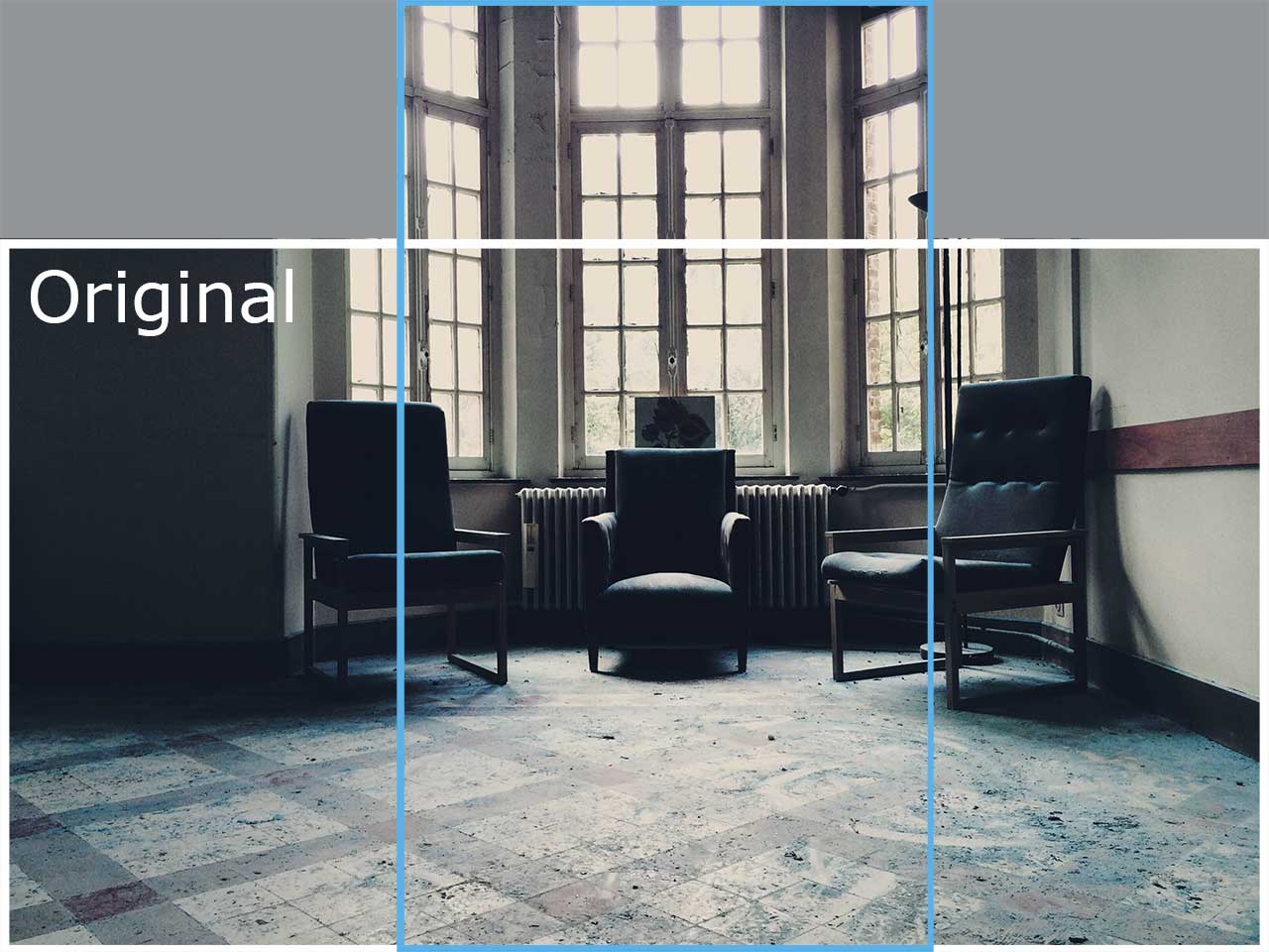
In 2015, I published an article about the various formats and, specifically, how to hold your iPhone when using another format than the square 1:1. It’s important to bear the final result in mind when choosing the "direction" for your capture. More info here.
Lastly, here is a video published in 2016, where the legendary photographer Steve McCurry gives us some pointers about composition, but… as Steve himself says: "Remember, the composition is important, but the rules are also meant to be broken. The main point is to enjoy yourself while you’re photographing and photograph in your own way and your own style."
This post is also available in: French


0 comments